I'm so happy to be accepted in the Beachbody Team by my coach Ashley Girard. My weight has been an on-going problem for me ever since I had my daughter. Well, that was my excuse. I got pregnant so it is naturally accepted fact that moms get fat, but it doesn't have to be that way. I have lost the fat and just to gain it back again so many times before. As of the moment, I am not overweight, as the ideal weight for my height is about 185lbs, but I still want to lose 10-20lbs more. I want to lose just a few pounds so I can wear nice clothes again and just to have that energy to do a lot of things. I don't want to lose more than that because I think I don't look good thin. I just want to sculpt my body to get the nice curves and I want to get back my confidence.
I have yo-yo dieted for a long time. Being around with my family who constantly eats junk food and sweets, it is really hard to stay away from. We love chocolates, we love desserts, we love anything sweet and being Asian we also eat a lot of carbohydrates. We eat a lot of rice, bread, pasta. Every meal consist of loads and loads or carbohydrates, salt and sweet. Hmmmm, not a goo combination right. So today I will start my day 1 again. I will not let my schedule or my partners schedule interfere with my goals.
Join me in my journey. Let's work out together. Let's start our new healthy life. So here's for the new me!!!
How about you? Care to share your story? Comment below..
Cheers!!!!
J and J Adventure
This blog started as a journal for my then 2 year old daughter, hence the title sweet, pretty and naughty, where I wrote her "first" adventures as a toddler. Fast forward to today..I'm in Brunei, trying my way through the adventures of what life will offer me. Expect to read about architecture,interior design, travel & most of all my musings as a mom. This blog is dedicated to my daughter...love you always. - Mommy
Wednesday, July 9, 2014
Friday, July 4, 2014
Interior Design: How to create a Sample Design Board
Sample Boards, Mood Board or Concept board, these are just some of the names that you may call this and for a lack of a better term let's use Sample Board for this blog. Interior designers, graphic artist, architects, photographers, advertisers and even make up artist use sample boards as a tool to convey their concept to clients. They place the color
samples, images of the selected furniture, examples of the materials to
be used and accessories selected for the project on a board.
A Sample Board may included the following pieces:
Tools needed to create a sample board
Creating the board
To see some of my sample boards here are some links:
Bachelor's Pad
Glam Nail Spa
Inner Sanctum
Prince Living Room
Living Room Design Board
A Sample Board may included the following pieces:
- swatches (paints , fabrics, wallpapers) basically little pieces of things you proposed to use
- Proposed Look - it can be perspectives, 3d, photos , or shop drawings, sketches
- Plans (floor plans)
- Materials (carpets and laminates etc.)
Tools needed to create a sample board
- Board (paper, foam, illustration, museum boards, or Gator board for heavy materials)
- Tape (masking, double sided, Velcro for heavy items)
- Cutting tool (Stanley knife, pinking shears, sharp scissors)
- Rulers (metal for cutting, scale rule for measuring)
- Pens and pencils (felt tip, soft pencil, colored pencils, colored pens)
- Adhesive (Clear all purpose, spray adhesive)
- Cutting mat
- Labels (usually white)
Creating the board
- Most designers leave a border of at least 1cm from the top and the 2 sides of the board
- A larger space is left at the bottom of the board
- The border can be colored to coordinate with the color scheme of the interior designing ideas.
- Work out the size for each item (for example the carpet sample would be bigger than a lamp)
- Trim the items to be placed on the board
- Fabrics can be cut with pinking shears to stop fraying
- If more than one room is involved in the project then each board should be labeled (living, bedroom etc.)
- Create labels for each item (labels can be created on your computer or by hand)
- Position each item on the board according where they would be placed in the room (for example carpet at the bottom of the board, ceiling paint sample at the top of the board)
- When you are happy with the arrangement you can use adhesive to place each item in place
- Remember Velcro can be used for heavy items (tiles, timber….)
To see some of my sample boards here are some links:
Bachelor's Pad
Glam Nail Spa
Inner Sanctum
Prince Living Room
Living Room Design Board
Labels:
concept boards,
design,
designer,
interior,
interior design,
mood boards,
sample boards
Wednesday, July 2, 2014
Interior Design : Room in a Box by Windsor Smith
Have you ever had your Interior Designer shipped right to your doors step? Well, now you can. Interior Design is very stressful and time consuming for both, either you are the client or you are the designer. It entails a lot of work, from actual site measurement , concept boards, samples boards, and so many other things. Sometimes you also want a particular designer to do it for you but your schedules just wont meet.
I have been toying with this idea for a long time in my head, being an Interior Designer/ Architect/ Project Manager I wanted to make things more simple for me. If I can get away into doing a "shortcut" in how it is done then this must be it.
Windsor Smith of Windsor Smith Home has actually brought this idea to mainstream. She launched Room in a Box which is a complete Interior Design that you can order online and have it shipped right to your door step. It is an innovative virtual design program on the internet. All you have to do is to go online and follow the steps and your just a few clicks from getting your Interior Designed Room. It is quite genius if you ask me, but then again this has been in every designers mind ever since. Somebody finally had a guts to do it. Coming up with an idea like this has its own pros and cons.
Pros:
Its fast and easy.
Can be done in the comfort of your home.
They claim to be cheaper and economical.
Gives you link to where you can purchase your items.
Less leg work.
Instant Gratification.
Cons:
More room for errors.
Can be unrealistic.
Actual site situations may vary constantly.
Can be costly if not done right.
Lack of professional advice.
Lack of personal touch.
Tuesday, July 1, 2014
Adobo as 4th of July Recipe by Gwyneth Paltrow
ok, so I was surfing the net and blog hopping and this is what I stumbled on. a 4th of July recipe which featured our very own Filipino dish Adobo. I was pleasantly surprised to see this post in Gwyneth Paltrow's blog goop. It goes to show that Filipino dishes are as much liked in other parts of the world. A different twist to our favorite home cooked dish adobo. This one is half-American using fried chicken and simmered slowly in the vinegar - soy sauce concoction.
This dish is not only interest in taste, but I am quite honored that our All-time-favorite Adobo dish is not just appreciated but also well loved to be featured in a very widely read blog such as goop and in a 4th of July issue? How awesome is that?
This is this is also featured in goop's instagram account, which is another reason to say "yey!!!" Just take a look at the comment section. Another idol just commented there, Ms. Daphne Osena Paez. How cool is that right? Hahaha.
Thursday, June 19, 2014
Ellana Mineral Argan Oil Review
 |
| Jojoba Argan Beauty Oil - photocredit MyMineral Brunei |
Jojoba Argan Beauty Oil
Our dual action Jojoba Argan Oil is gentle enough to be used for the entire face including the eye area. Jojoba Oil nourishes and moisturizes the skin and helps improve supplenss while Moroccan Argan oil is a traditional cosmetic and healing oil that is produced by the Berber women of Morocco. It is currently the most sought after anti-aging oil. High in vitamins A, E and Omega 6. It has an amazing ability to repair skin. May be used as make up remover , as it instantly dissolves and removes all traces of make up.
This is not a paid review, my statement as written on this blog is true and actual as per my own experience.
I have a love / hate relationship with the Ellana Mineral Jojoba Argan Oil. I must admit when I first used it months ago, I didn't like it. It is good for my skin, its very moisturizing and delivered what was promised on the flyer and delivered what I expected. It helped with my acne problem and gave me a more healthy looking skin. But I have one problem. I didn't like the feeling of oiliness. I already have a very oily skin, and putting additional oil on it only adds to the eeky feeling through out the day, and because of that I stopped using it.
Fast forward to a month ago. I was washing my face after a long day of work, I noticed my facial wash didn't take out all the mascara and eyeliner residue. So I grabbed the Ellana Mineral Jojoba Argan Oil, and put a spritz or 2 on a cotton swab and used that to take out my makeup gunk on the eye area. Then I flipped the cotton swab and used it to clean the rest of my face. After doing so, I rinsed my face with water then clean it with my usual face cleanser, then rinse again. Whoalllaaaa!!!! Problem solved. I can now use my Ellana Mineral Jojoba Argan Oil, without the eeeekkky oily after shock.
Just a little tweak in my routine solves the problem. When I first used my Ellan Mineral Jojoba Argan oil, I did it backwards. I wash my face first, then with a cotton patch I would used it all over my face, without rinsing it afterwards. Hence, leaving my face with an oily feeling. Fast forward to now. I am very glad to rediscover the power of Ellana Mineral Jojoba Argan Oil. It is not just a good make up remover, but it also moisturize my skin thus giving it a healthy looking skin. This helped me even out my skin tone and the most wonderful effect I got from using the Ellana Mineral Jojoba Argan Oil is that it helped diminish my acne marks in a very short time. I've only been using this product for less than a month, and it took out all the acne marks. Something I've always wanted. No need for laser, no need for microdermabration, no need for painful facials at the derma. I am very thankful for the Ellana Mineral Jojoba Argan Oil, now I don't need to put heavy make up to cover my blemishes. I can even getaway with using just the Ellana Mineral Espresso con Panna finishing powder.
My Before (left) and after (right) pictures are a true testament of the product. You can see that I have many acne dark spots on my before pictures. If I only have a better resolution camera then it will show more blemishes on my face. The after picture shows that all the dark acne spots are gone, even the small indentation at my upper right forehead is gone. It completely healed all my problem areas. Thank you Ellana Mineral.
Friday, March 28, 2014
I Am an Architect
I am an ARCHITECT.

Graduated 2003 from the No.1 College for Architecture, University of Santo Tomas, Manila, Philippines.
I took the board exam 2 years early and passed on my first take. Got my license 2004, right after I graduated. This is not allowed anymore, since it is stipulated in the laws that you can only take the board exam 2 years after graduation. During my college years, they only specify that you need to have 2 years diversified experience in Architecture, the very clever me saw a loop hole on that law and instead of taking the board exam 2 years after I graduate, I took a different route. I started working when I was in 3rd year college. So by the time, I graduate (Architecture is a 5 year course) I already have the 2 years experience as well. I was working as for DM Consunji Inc. one of the biggest Construction Firms in the country and finishing my degree at the same time.
I enrolled in a review center February 2013, I graduated March 2013. #multitask
I have worked in all the fields of Architecture.
Project Management
Construction Supervision
Design
Purchasing
Sales
Building Management
Name it, I've done it.
 Project Management / Construction / Supervision
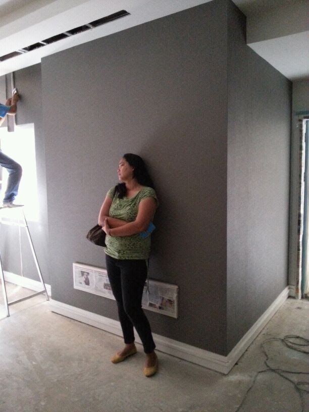
My first real job, after graduation is with Daiichi Properties where I worked as a Project Coordinator. My task is to coordinate all information between the Consultants , Project Managers, Contractors, Sub-Contractors, Clients, Owners, Marketing. We were building High Rise Buildings. This is where I experienced using the construction elevators that we fondly call "Alemak". It is the an elevator that is like a cage, that you can see everything outside no walls. This is where I experiences playing "patintero" on top of the 38 storey high helipad. Where I experience all the first mistakes in a real job. I learned a lot.
Building Management
After high rise buildings, I went low. I may not be in huge in height but still huge in floor area.
I was Mall Architect for Robinsons Malls. I was the first "Mall Architect" who handled 4 malls at a time. I was in charge of the following malls.
Robinsons Place Pioneer
A mall architect should only handle 1 mall at a time. Multiple malls are handled by District Mall Architects, which is a higher position whom mall architects report too. But for some reason, they entrusted me to handle 4 malls at a time. On my first few months of being Mall Architect I was so scared, completely terrified. I lack the confidence and experience of handle such an enormous job. But I did not falter, I learned all the ropes of being a mall architect. I learned to "punchlist" all items while strolling in the mall. To have a keen eye of the tiny defects that most naked eye dont see. To have an imaginative eye on how to make it more beautiful, to have a business sense on how to bring in more patron, more money to the company.
It is where I experienced going up the roof to check damages while the mighty Ondoy typhoon is going on. It is where I experience seeing the whole 3 floors of mall get flooded. It is where I saw a whole roof of a huge Cinema got torn out like a tissue, including its purlins and truss. It where I experience leaping from 1 building to the next on a 6 inch plank of wood with at least 40 meters below me. It is where I triumphantly presented a different design concept for redevelopment, against a team of highly experienced Architect of Palafox and Associates. The Management believed in me, and trusted me with a multi-million peso budget. It was a huge success. After that redevelopment, the Mall started getting more foot traffic, and high end brands for retail.
I learned a lot.
Design / Purchasing / Sales / Construction
I also started putting up my own company, and to tie-up with construction companies. I was principal Architect for Havenas Inc. , Havitall Corp. and my own Design Insignia. This is where I experienced the reality of being an Architect, that you cannot dictate what you want in an design and you will have to compromise with the clients vision, even if it is against your concept of beauty or practicality or even logic. It is where I learned that in the real world, you will have to bend your own rules, to close a deal or to claim for payment. I must have done more than 40 residential houses, 10 retail spaces, 10 offices. This is the time I learned to design the outside (architecture) and the inside (interior design). A place of money making (retail spaces), or baby making (motel rooms). A place of beauty (derm clinics, spas, etc). A place for the dead (mausoleum). I learned a lot.

Fast Forward to Now
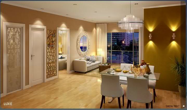
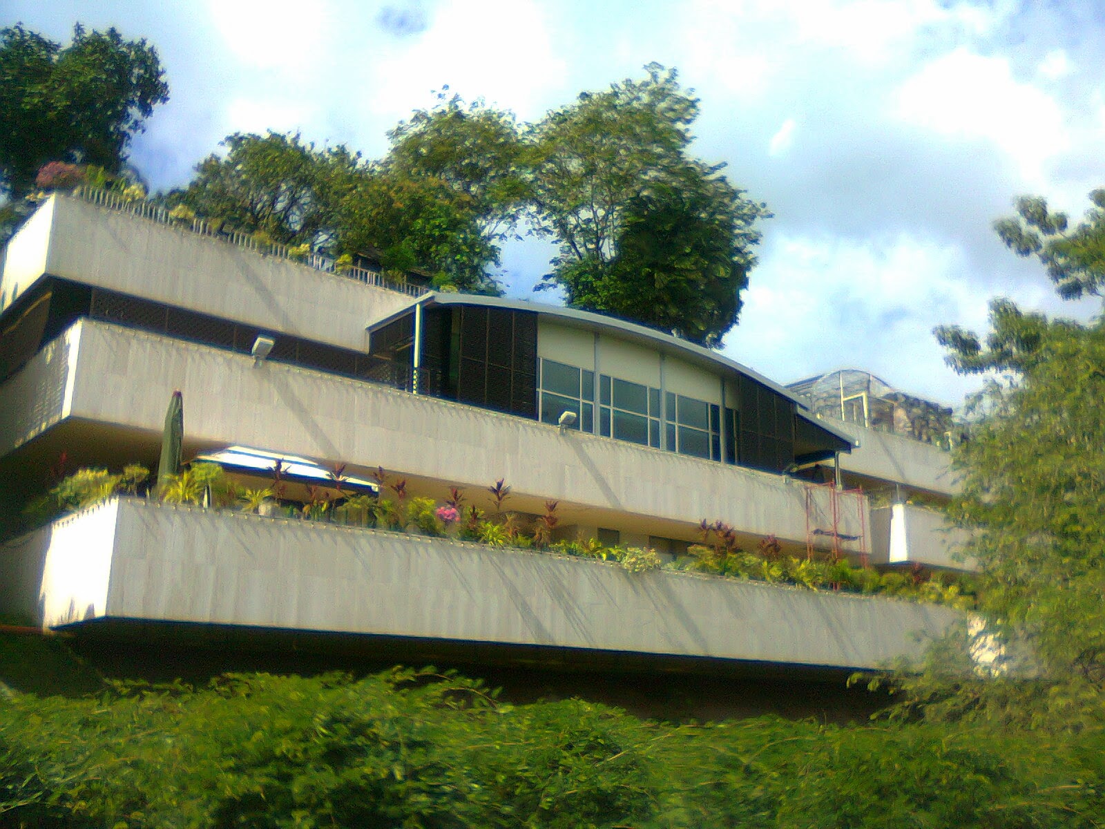
Today I am in a different land, a different world, trying to put in to practice what I have learned. I am in Brunei, a country of wealth and prosperity, where the nation is rich but yet very old fashioned. Where lifestyle is laid back but the culture is rich.
 Where
architecture is very different from what I used to know. This is where I
have experienced the best and worst of being an employee. Where I was
made to clean toilets yet my position is "Architect". It is where I
designed and renovated housed for the Kings and Queens. Where I go
inside palaces and meet the royals. It is where I realize that my
beloved country Philippines is still far more beautiful even if its full
of traffic jams and pollution. It is where I realized than I and the
rest of the Filipinas/Filipinos are far more beautiful inside and out.
So here I am now, trying to learn more.
How about you? Where are you now? What have you learned? Comment below, share you story.

Graduated 2003 from the No.1 College for Architecture, University of Santo Tomas, Manila, Philippines.
I took the board exam 2 years early and passed on my first take. Got my license 2004, right after I graduated. This is not allowed anymore, since it is stipulated in the laws that you can only take the board exam 2 years after graduation. During my college years, they only specify that you need to have 2 years diversified experience in Architecture, the very clever me saw a loop hole on that law and instead of taking the board exam 2 years after I graduate, I took a different route. I started working when I was in 3rd year college. So by the time, I graduate (Architecture is a 5 year course) I already have the 2 years experience as well. I was working as for DM Consunji Inc. one of the biggest Construction Firms in the country and finishing my degree at the same time.
I enrolled in a review center February 2013, I graduated March 2013. #multitask
I have worked in all the fields of Architecture.
Project Management
Construction Supervision
Design
Purchasing
Sales
Building Management
Name it, I've done it.
 Project Management / Construction / Supervision
My first real job, after graduation is with Daiichi Properties where I worked as a Project Coordinator. My task is to coordinate all information between the Consultants , Project Managers, Contractors, Sub-Contractors, Clients, Owners, Marketing. We were building High Rise Buildings. This is where I experienced using the construction elevators that we fondly call "Alemak". It is the an elevator that is like a cage, that you can see everything outside no walls. This is where I experiences playing "patintero" on top of the 38 storey high helipad. Where I experience all the first mistakes in a real job. I learned a lot.
Building Management
After high rise buildings, I went low. I may not be in huge in height but still huge in floor area.
I was Mall Architect for Robinsons Malls. I was the first "Mall Architect" who handled 4 malls at a time. I was in charge of the following malls.
Robinsons Place Pioneer
Robinsons Place Sta. Rosa
Robinsons Place Metro East
Robinsons Place Los BanosRobinsons Place Metro East
A mall architect should only handle 1 mall at a time. Multiple malls are handled by District Mall Architects, which is a higher position whom mall architects report too. But for some reason, they entrusted me to handle 4 malls at a time. On my first few months of being Mall Architect I was so scared, completely terrified. I lack the confidence and experience of handle such an enormous job. But I did not falter, I learned all the ropes of being a mall architect. I learned to "punchlist" all items while strolling in the mall. To have a keen eye of the tiny defects that most naked eye dont see. To have an imaginative eye on how to make it more beautiful, to have a business sense on how to bring in more patron, more money to the company.
It is where I experienced going up the roof to check damages while the mighty Ondoy typhoon is going on. It is where I experience seeing the whole 3 floors of mall get flooded. It is where I saw a whole roof of a huge Cinema got torn out like a tissue, including its purlins and truss. It where I experience leaping from 1 building to the next on a 6 inch plank of wood with at least 40 meters below me. It is where I triumphantly presented a different design concept for redevelopment, against a team of highly experienced Architect of Palafox and Associates. The Management believed in me, and trusted me with a multi-million peso budget. It was a huge success. After that redevelopment, the Mall started getting more foot traffic, and high end brands for retail.
I learned a lot.
Design / Purchasing / Sales / Construction
I also started putting up my own company, and to tie-up with construction companies. I was principal Architect for Havenas Inc. , Havitall Corp. and my own Design Insignia. This is where I experienced the reality of being an Architect, that you cannot dictate what you want in an design and you will have to compromise with the clients vision, even if it is against your concept of beauty or practicality or even logic. It is where I learned that in the real world, you will have to bend your own rules, to close a deal or to claim for payment. I must have done more than 40 residential houses, 10 retail spaces, 10 offices. This is the time I learned to design the outside (architecture) and the inside (interior design). A place of money making (retail spaces), or baby making (motel rooms). A place of beauty (derm clinics, spas, etc). A place for the dead (mausoleum). I learned a lot.

Fast Forward to Now
Today I am in a different land, a different world, trying to put in to practice what I have learned. I am in Brunei, a country of wealth and prosperity, where the nation is rich but yet very old fashioned. Where lifestyle is laid back but the culture is rich.
 Where
architecture is very different from what I used to know. This is where I
have experienced the best and worst of being an employee. Where I was
made to clean toilets yet my position is "Architect". It is where I
designed and renovated housed for the Kings and Queens. Where I go
inside palaces and meet the royals. It is where I realize that my
beloved country Philippines is still far more beautiful even if its full
of traffic jams and pollution. It is where I realized than I and the
rest of the Filipinas/Filipinos are far more beautiful inside and out.
So here I am now, trying to learn more.
How about you? Where are you now? What have you learned? Comment below, share you story.
Tuesday, March 18, 2014
Bachelor's Pad Interior Design Project
As
soon as you enter the room, the first thing you will see is the
bookshelf. The book shelf is designed in such a way that it is modern,
and yet not too trendy. It becomes a focal point as you enter the room.
This sets the mood for the rest of the design accents. I chose to use
dark charcoal color for the main accent furniture for it to pop up from
the walls. A basic color that is both manly and yet modern. The shelf
is chunky for better support and to make it look more "designed" and not
just store bought pieces. This chunky shelves continues to the TV/
entertainment system, same simple and sleek lines.
Clean and sophisticated look. The base cabinet can be used for more
storage and the top for entertainment devices. The TV can be wall
mounted to accommodate more counter space. We can also add a strip of
LED lights under the TV counter for mood lighting.
For
the kitchen, I chose to move the fridge where the range should be, for
us to have more space. The area where the fridge will now have a
counter, that can be used both for dining as well as preparation area
for cooking. This is also a good open space for entertaining, where you
can entertain your guest while cooking, more of an open kitchen so there
is more
interaction. I would suggest for you to use a standard dining height
for the counter so you can use ordinary chairs, it is more comfortable
than bar stools. The cube ottoman/ stool that is used as
coffeetable/ottoman in the living area can also be used for extra
sitting for this dining area. This counter can comfortable sit 3-4
persons, but can also be expanded up to 6 person use.
For
the Bedroom, as per our discussion, I took out the wall in between the 2
bedrooms. This give more room and a more flexible way to layout the
furniture. I moved the closet to Bedroom 2, where the door opens to.
Because of this I
suggest to take out that door ad just use the door going to the Bedroom
1. The back wall at the back of the bed becomes a feature wall. The
column and beam is already there, so instead of concealing it I used the
existing architecture as an accent. So I added a built up wall on the
opposite site of the column to balance it out and for symmetry. You can
opt to use a wall paper or just a different paint color for this to make
it stand out. You can also line the sides of this wall with cove
lighting that will add drama to the space.
On
the opposite wall, i demolished a part of that wall and placed a TV/
Study console. It
is both your TV wall and right behind that is your study area. We can
have it designed that the wall pivots from 1 space to the other so u can
have just 1 TV both can be viewed on both sides. You can also hook up
your TV to be the monitor for you PC so you save more space and much
easier for you to shift. At the opposite side of your table is a
customized bench, something like your day bed at the living room. and
hanging shelves to the corner. This is a good place for you to sit and
relax while enjoying a nice book. The bench will also come handy when
you dress up, to put on your shoes or socks.
Subscribe to:
Comments (Atom)


